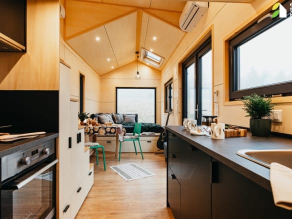
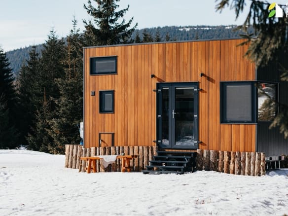
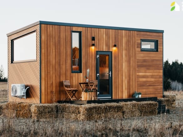
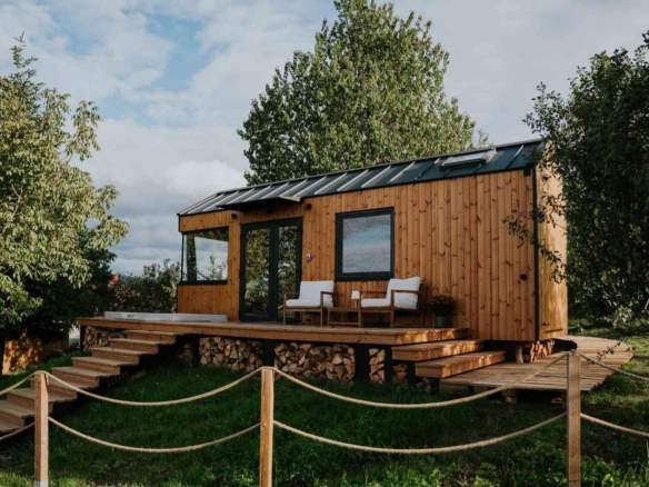
To date, we’ve built and delivered more than 550 tiny houses to customers all across Europe. With an annual capacity of 80 to 100 homes, we’re proud to be helping more and more people live intentionally without compromising on comfort, quality, or style.
We build everything in-house, from the custom steel chassis to the last cabinet handle. This hands-on process allows us to guarantee consistent craftsmanship and offer solutions tailored to real needs.
For us, this is more than just construction. We’re creating homes that support a new way of living. More sustainable, flexible, and better connected to what really matters.
Learn more about Eco Tiny House
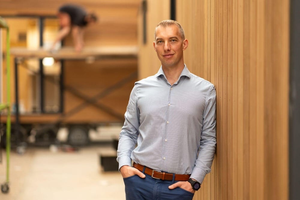
Explore an engaging discussion with Szakács Botond, CEO of Eco Tiny House, to explore the journey from a personal project on wheels to a thriving company dedicated to eco-friendly design, mobility, and minimalist living without compromise.
Read more
/* Reset default margins and paddings for all elements */
.blog-preview,
.blog-preview * {
margin: 0;
padding: 0;
box-sizing: border-box;
}
/* Blog preview container */
.blog-preview {
display: flex;
flex-direction: column; /* Stack title on top and rest below */
width: 100%;
background: #F5F5F5; /* Entire section background */
border: 1px solid #ddd;
border-radius: 4px; /* Rounded edges */
overflow: hidden;
}
/* Title at the top */
.blog-preview-title {
width: 100%;
padding: 10px 20px; /* Reduced padding for a tighter look */
font-size: 1.5em;
text-align: left; /* Align title to the left */
background: #F5F5F5; /* Match the section background */
border-bottom: 1px solid #ddd; /* Separation line */
}
.blog-preview-title a {
text-decoration: none;
color: #333;
}
.blog-preview-title a:hover {
text-decoration: underline;
}
/* Content (image and text) */
.blog-preview-content {
display: flex;
flex-direction: row; /* Align image and text in one line */
gap: 15px; /* Reduced space between image and text */
align-items: start; /* Aligns text and image at the top */
width: 100%;
padding: 0 20px; /* Keeps consistent alignment */
}
/* Left column for the image */
.blog-preview-image {
flex: 1 1 33%; /* Image takes up 1/3 of the width */
max-width: 33%;
overflow: hidden;
display: flex;
align-items: center;
justify-content: center;
}
.blog-preview-image img {
width: 100%;
height: 100%;
object-fit: cover; /* Fill the space while maintaining aspect ratio */
display: block;
}
/* Hide image on mobile devices */
@media (max-width: 768px) {
.blog-preview-image {
display: none; /* Hide the image on smaller screens */
}
}
/* Right column for the text */
.blog-preview-text {
flex: 2 1 67%;
padding: 10px 0; /* Reduced vertical padding */
font-size: 1em;
line-height: 1.5;
color: #555;
display: flex;
flex-direction: column;
justify-content: center;
}
/* Read more button */
.blog-preview-text .read-more {
font-size: 1em;
color: #5F56BF; /* Default color */
text-decoration: none;
font-weight: bold;
}
.blog-preview-text .read-more:hover {
color: #554DAB; /* Hover color */
}